
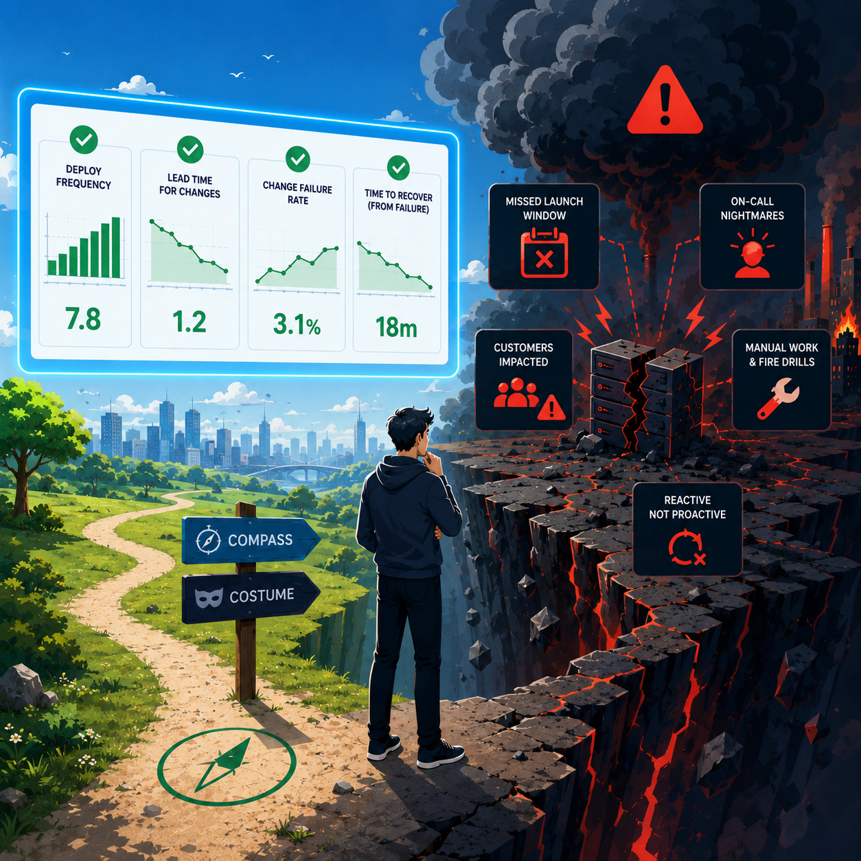
I have sat in a review where every delivery tile was the cheerful color.
Those four are what most dashboards still put on the wall, even though the research set has kept evolving. The product still missed the launch window. On-call was still ugly. Nobody was confused about the tiles.
Everybody was confused about how the tiles were allowed to be fine.
That scene is not a research finding. It is a room I have been in. The useful question is what those tiles are for, and what they are terrible at.
Keep the nouns. Drop the religion.
You need shared language when someone asks how delivery is going. The DORA research program has spent years on a small set of software delivery performance metrics for exactly that kind of conversation: how fast changes move, how often you deploy, how often deploys need emergency intervention, and how long recovery takes when a deploy goes wrong. The published model is no longer only "four keys" (recovery is framed around failed deployments, and there is also unplanned rework from production incidents), but you do not need a history seminar to use the idea.
The research also claims something managers still argue about in hallways: over long periods, speed and stability are not a forced tradeoff. Teams that do well tend to do well on both throughput and stability. That is their finding. Treat it as a reason not to accept "we ship slow because we care about quality" as a permanent lifestyle.
What you should not keep is the costume party. "Elite" as a personality. Green dashboards as moral victory. Ranking squads because a template had a column for it. The DORA guide itself calls the metrics a compass for continuous improvement, not a tournament bracket.
How the metrics get abused
The same guide is blunt about failure modes. The interesting ones for real organizations are not exotic.
- Metrics as goalsDORA warns that turning delivery metrics into org-wide targets increases gaming, and points at Goodhart's law: when a measure becomes a target, it stops being a good measure. I once watched a team "fix" deploy frequency by shipping a stream of releases that changed a version string and nothing a user could notice. The chart went vertical. The roadmap did not. That is what goal pressure looked like in one corridor.
- Wrong unit of comparisonThe metrics are meant to be applied at the application or service level. Blending them across unlike systems, or across a whole company as if it were one machine, is called out as problematic. An org-wide average lead time that looks "okay" while one service waits two weeks on review is not mysterious. It is arithmetic hiding a fire. Refuse the average when the unit is wrong.
- CompetitionDORA's guidance is to improve your team's performance over time, not to compete against other teams or organizations. The moment lead time becomes a ranking in a performance cycle, the data gets weirder. I have seen tickets split into confetti and reviews that were not reviews. The published anti-pattern is the competition. The confetti is what it looked like that week.
- Hero recoveryFast recovery from a bad deploy can mean excellent operations. It can also mean the same two people always answer the pager. The metric alone will not tell you which. If restore time is excellent and those people are burning out, you did not win. You outsourced the number to martyrs. Treat that as a diagnostic question, not a score.
- Measurement without improvementAnother named pitfall: obsessing over perfect data plumbing while the delivery process stays the same. A prettier tile is not a better quarter. A dashboard nobody uses to make a different decision is furniture, not analytics.
When a metric moves, look sideways
The outcome metrics lag the practices that produce them. DORA's own framing treats them as lagging indicators of how you build and deliver. So when lead time or deploy frequency finally shifts on the org slide, the cause has often been sitting in the open for weeks.
When DORA describes how to improve, they do not say "stare harder at the four tiles." They say find the friction, pick the main bottleneck, and add more specific measures as leading indicators. Their examples include how long code reviews take and the quality of your tests. That is the research anchor for looking sideways.
- Code review duration / time to first reviewIf changes sit unreviewed, everything downstream is cosplay. If more diffs arrive than reviewers can honestly read, lead time will lie to you until you measure the queue.
- Test quality (including pipelines that cry wolf)If you cannot trust the suite, people batch, delay, and ship scared. You do not need a special brand name for that. You need to know whether green means something.
- Batch sizeDORA treats working in small batches as a core lever: smaller changes are easier to understand, move through the process, and recover from when they fail. Huge pull requests with a "fast deploy culture" poster on the wall are a contradiction you can feel in review, even before the outcome chart moves.
- Friction in the pathMapping the delivery process is part of their suggested conversation. A lot of "slow engineering" is queue time: review, environments, security, product clarification. If you only shout at coding speed, you are yelling at the wrong stage.
None of that replaces the outcome metrics. It explains them. Explanation is the job when the green tile and the red quarter disagree.
A compass has rules
- Fight a process, not a person"Review wait is eating lead time on checkout" is a systems sentence. "Alice is slow" is how you lose the room and eventually the data.
- Prefer the right unit and the ugly tailService by service. Window by window. Middle and tail, not one vanity mean that flatters the org chart.
- Improve against your own baselineThat is the DORA posture on competition. Your product, regulation, and risk tolerance still own the targets. Elite in a regulated product shipping monthly is not the same claim as elite in a consumer app shipping hourly. Other people's labels are not a personality you can put on.
- Change one thing and decide what would make you stopThe published improvement loop is roughly: baseline, find friction, commit to the bottleneck, plan with leading measures, do the work, check, repeat. A slogan is not a step in that loop.
"We will limit open pull requests for six weeks; if median lead time does not improve by at least a day, or deploys needing a hotfix or rollback rise, we revert."
What I want in the room
When someone puts up cheerful delivery tiles after a bad quarter, I want questions like these:
- Q1Which application or service is in the tail, and which stage is eating the days?
- Q2Did deploy frequency rise because users got value sooner, or because we learned to tickle the counter?
- Q3Is recovery fast because the system is healthy, or because the same two people never sleep?
- Q4What leading signal moved before the outcome metric moved: review wait, batch size, test trust, something else in the path?
If nobody can answer, you do not have delivery analytics. You have interior decoration.
A working loop, not a transformation offsite
If the green tile and the red quarter still disagree
The trap this essay is about does not disappear because you bought software. Any tool that only restates the same four cheerful numbers will become furniture again.
We build Positron Flux to put the outcome metrics next to the boring signals that explain them (review wait, batch size, test trust, path friction), and to support the loop above: one service, one change, leading measures, a kill date. If that is the work in front of you, get in touch, talk with us for thirty minutes, and decide if the fit is real.